Telehealth Landing Pages for Paid Social: What Converts
Landing page structure, messaging, and conversion optimization for GLP-1, TRT, ED, and hair loss paid traffic. Frameworks from $50M+ managed spend.
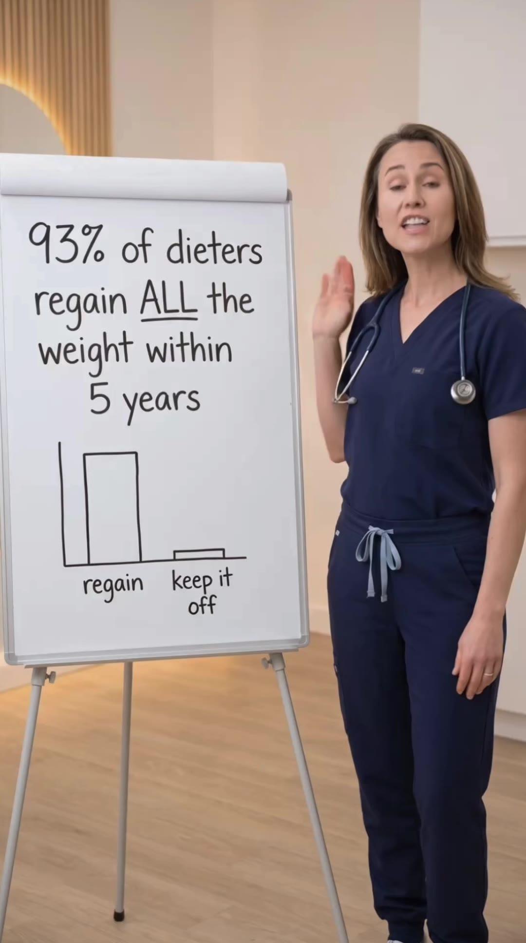
Concepts shown are internal creative studies, not client campaigns.


Landing page conversion rate determines whether your paid social succeeds or fails. After managing $50M+ in telehealth paid social spend, the difference between profitable and unprofitable campaigns is rarely the ads—it's the landing page experience. Ads drive traffic, landing pages convert traffic into customers.
Above-the-Fold Requirements
The headline must match ad messaging exactly. If your ad says "Online GLP-1 prescription in 24 hours," your landing page headline must say the same. Message mismatch creates 30-50% bounce rates. Users click expecting one thing, land on a page offering something different, and leave immediately.
Display pricing above the fold. "Prices start at $X/month" or "Free consultation, medication from $X" removes the #1 objection before users scroll. Hidden pricing forces users to complete forms just to see cost, which increases form starts but decreases completion rates. Transparent pricing delivers 20-30% higher conversion than hidden pricing.
Show clear CTA button above fold: "Get Started", "Book Free Consultation", "Start Assessment." The button should contrast with background, use action language, and appear within 1-2 scrolls maximum. Users who don't see CTA within 5 seconds have 60% higher bounce rates than those who immediately understand the desired action.
Trust Signals and Credibility Elements
Display medical credentials prominently: "Board-certified doctors", "Licensed in all 50 states", "Prescription medication, not supplements." Telehealth requires trust-building that e-commerce does not. Users are sharing health information and trusting medical advice. Credibility signals reduce bounce rates by 15-25%.
Show security and privacy badges: HIPAA compliance, secure checkout, discreet packaging. Prescription drug purchases carry privacy concerns. Users worry about data security, insurance impacts, and shipping discretion. Address these concerns explicitly with badges and brief copy points.
Include customer testimonials with verification indicators. "2,500+ verified customers", "4.8/5 rating", "Featured in [credible publication]" build social proof. Unverified testimonials feel fake. Verified volume metrics (thousands of customers) perform better than cherry-picked individual stories.
How It Works Section
Structure "How It Works" in 3-4 steps maximum. Complex multi-step processes reduce conversion. Standard structure: "1. Complete health assessment (5 minutes), 2. Doctor reviews and prescribes (24 hours), 3. Medication ships to your door (2-3 days), 4. Ongoing care and refills." Clear timeline expectations prevent abandonment.
Address qualification concerns upfront. "95% of patients qualify" or "Most patients approved same-day" reduces fear of wasting time on forms only to be rejected. Qualification anxiety is a major conversion killer. Transparent approval rates improve form completion by 20-30%.
Show what happens if not approved. "If our doctors determine treatment isn't right for you, you pay nothing." This eliminates risk perception. Users fear paying consultation fees only to be denied treatment. Explicit "pay only if approved" messaging converts 15-20% better than vague qualification language.
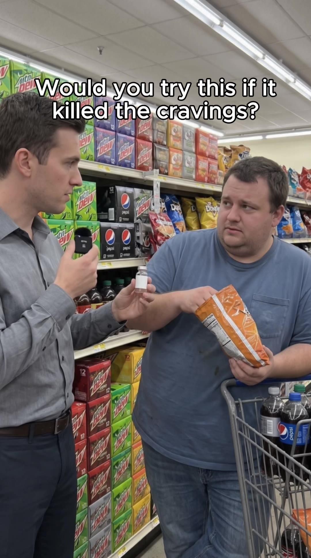
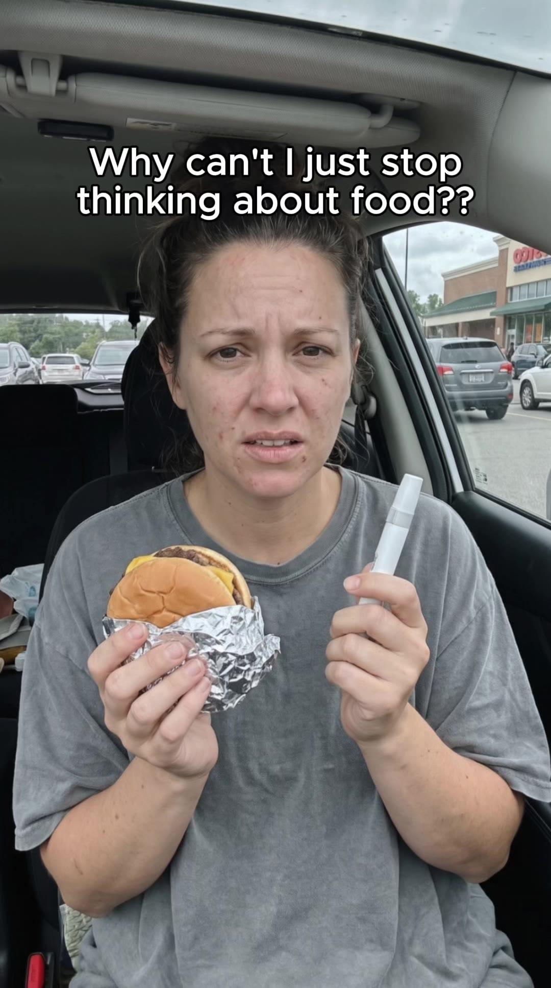
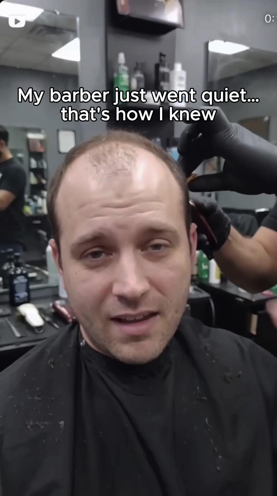
Concepts we ship across every awareness stage.
See the work →Treatment Information Section
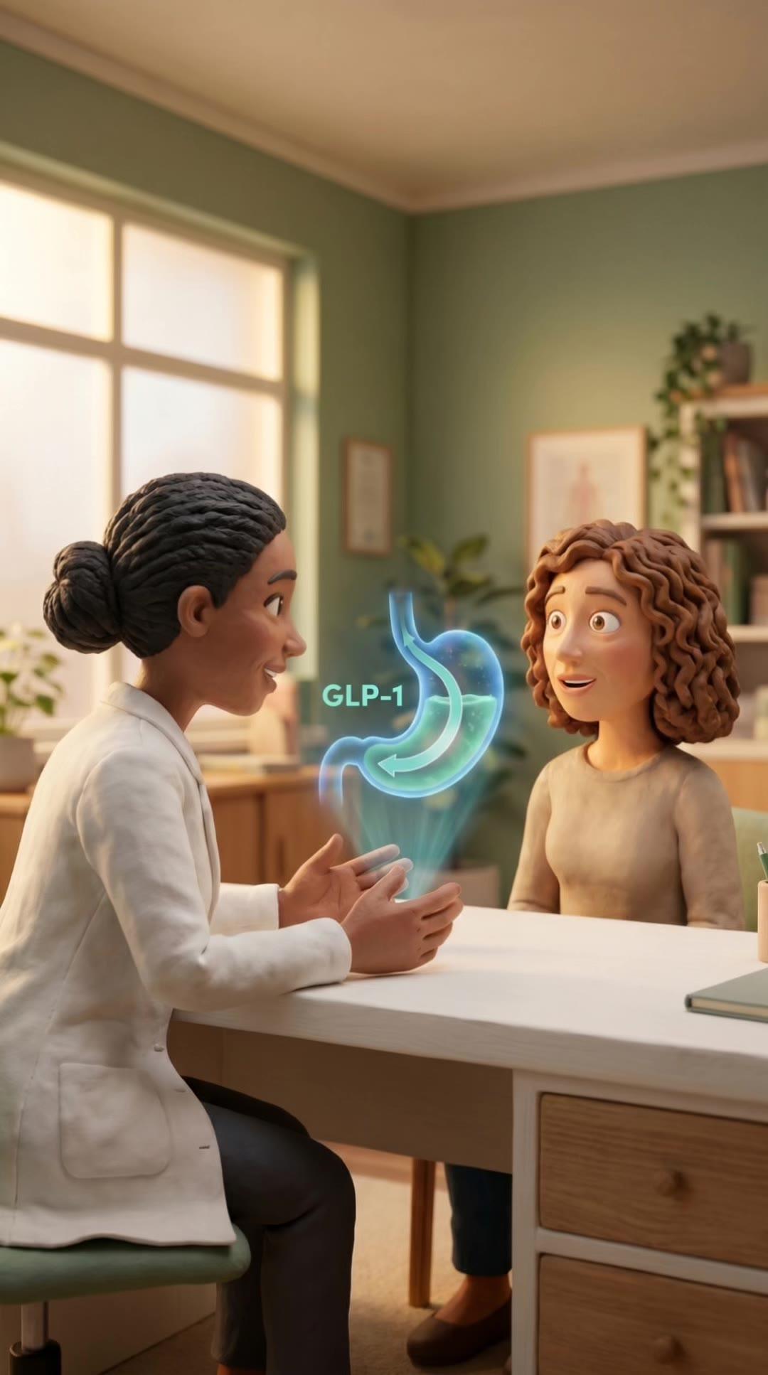
Include just enough education to build confidence, not so much that users get overwhelmed. For GLP-1: explain what GLP-1 agonists are, how they work, expected outcomes (10-15% body weight loss over 3-6 months), and what to expect from treatment. Keep this section 150-200 words maximum.
Compare branded vs. compounded options transparently. "We offer both brand-name and compounded semaglutide. Compounded costs $X/month, brand-name costs $Y/month. Both are FDA-approved ingredients." This honesty improves trust and allows users to self-select based on budget.
Address side effects briefly but directly. "Common side effects include nausea, constipation, and fatigue. Most patients experience minimal side effects that decrease over time." Ignoring side effects creates suspicion. Overstating them creates fear. Brief, factual acknowledgment balances both. For compliance-safe approaches, reference telehealth advertising compliance.
Pricing Section Structure
Display all-in pricing, not just medication cost. "$150/month includes medication, doctor consultations, and ongoing care" is clearer than "$120/month + consultation fees." Hidden fees discovered at checkout create 40-60% cart abandonment. Transparent all-in pricing prevents this.
Show pricing tiers if applicable. "Starter dose $X/month, maintenance dose $Y/month, maximum dose $Z/month." This sets expectations that pricing may change as dosage adjusts. Users who discover higher dosage costs later feel deceived and churn faster.
Include insurance and FSA/HSA language. "We don't accept insurance, but you can use FSA/HSA cards" or "Insurance reimbursement available—we provide documentation." Many users assume telehealth takes insurance. Explicit insurance language prevents form abandonment when users reach payment and discover limitations.
Mobile Optimization Requirements
70-80% of paid social traffic comes from mobile. Landing pages must load in under 3 seconds on mobile. Pages taking 5+ seconds see 50%+ bounce rates before content even appears. Compress images, minimize scripts, use fast hosting.
Mobile CTAs should be fixed bottom bars. Scrolling to find CTA buttons reduces mobile conversion by 30-40%. Fixed "Get Started" button at bottom of screen keeps action accessible at all times. Desktop can use inline CTAs, mobile requires persistent visibility.
Reduce mobile content by 30-40% compared to desktop. Mobile users scroll less, read less, and abandon faster. Desktop landing pages can include detailed FAQs, extensive testimonials, and deep education sections. Mobile should be streamlined to core trust-building and CTA.
Form Design and Optimization
Start forms on separate page, not inline on landing page. Landing pages educate and build trust. Forms collect information. Combining both creates cognitive overload. "Get Started" button should transition to form page, not expand inline form fields.
Show progress indicators for multi-step forms. "Step 1 of 3: Basic Information" reduces abandonment by 20-30%. Users commit to complete if they understand total time investment. Forms without progress feel endless, causing premature abandonment.
Ask only medically necessary questions. Every additional form field reduces completion by 5-10%. GLP-1 forms need: current weight, target weight, relevant medical history, current medications. They do not need: employment status, household income, detailed lifestyle questions. Extensive health histories can happen during doctor consultation, not initial form.
Retargeting-Specific Landing Pages
Create separate landing pages for retargeting traffic. Users who already visited your site don't need "How It Works" education. They need objection handling: pricing concerns, qualification questions, comparison to competitors. Retargeting pages should be 50% shorter than cold traffic pages.
Retargeting headlines should reference prior visit: "Welcome back—ready to get started?" or "Questions about treatment? We're here to help." This continuity acknowledgment feels personalized and improves conversion by 15-25% compared to generic retargeting landing pages.
Include FAQ sections on retargeting pages addressing common objections: "Is this legal?", "How do I know this is safe?", "What if I don't qualify?", "Can I cancel anytime?" These questions prevent prior visitors from converting. Direct answers remove friction. For retargeting creative and messaging, see telehealth retargeting on Facebook.
Conversion Rate Benchmarks and Testing
Cold traffic landing page conversion: 8-15% for GLP-1, 10-18% for TRT, 15-25% for ED, 12-20% for hair loss. If your conversion rates are 50%+ below these ranges, fix landing page before increasing ad spend. Driving more traffic to low-converting pages wastes budget.
Retargeting landing page conversion: 20-35% for all verticals. Retargeting traffic is warmer, higher-intent, and requires less education. If retargeting conversion rates are only 10-20% higher than cold traffic (should be 2-3× higher), your retargeting page isn't differentiated enough from cold traffic experience.
Test one element at a time: pricing visibility, headline messaging, form length, trust signals, mobile CTA placement. Simultaneous multi-variable testing creates attribution confusion. Sequential testing takes longer but delivers clear learnings. Run tests for 1,000-2,000 visitors minimum before declaring winners. For testing frameworks, review telehealth creative testing.
Related Articles
Telehealth Creative Testing Framework: What to Test and How
Systematic creative testing for GLP-1, TRT, ED, and hair loss paid social. Hook testing, format comparison, and iteration strategy from $50M+ managed spend.
Brief a Telehealth Creative Agency: Assets, Timelines, and Deliverables
How to brief creative agencies for GLP-1, TRT, ED, and hair loss ads. Asset requirements, feedback cycles, and deliverable expectations from $50M+ spend.
Telehealth In-House vs. Agency Creative: When to Build vs. Buy
When to hire in-house creative teams vs. using agencies for GLP-1, TRT, ED, and hair loss paid social. Cost breakdown and decision framework.
Telehealth Paid Social Budget: How Much to Spend and When to Scale
Budget allocation framework for GLP-1, TRT, ED, and hair loss paid social. Testing budgets, scale thresholds, and efficiency benchmarks from $50M+ spend.
Ready to build a testing system that scales?
A 30-minute call. We audit your creative approach and show you exactly what a complete angle-format-hook system looks like for your vertical.