How Publisher Pages Change Your Telehealth Ad Creative
Running telehealth ads through publisher pages is not just a distribution decision — it changes what creative works, what hooks land, and how compliance framing should be approached.
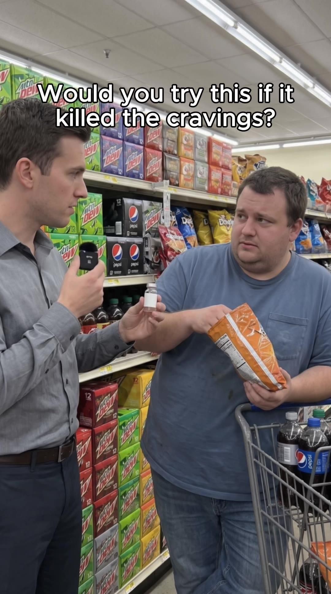
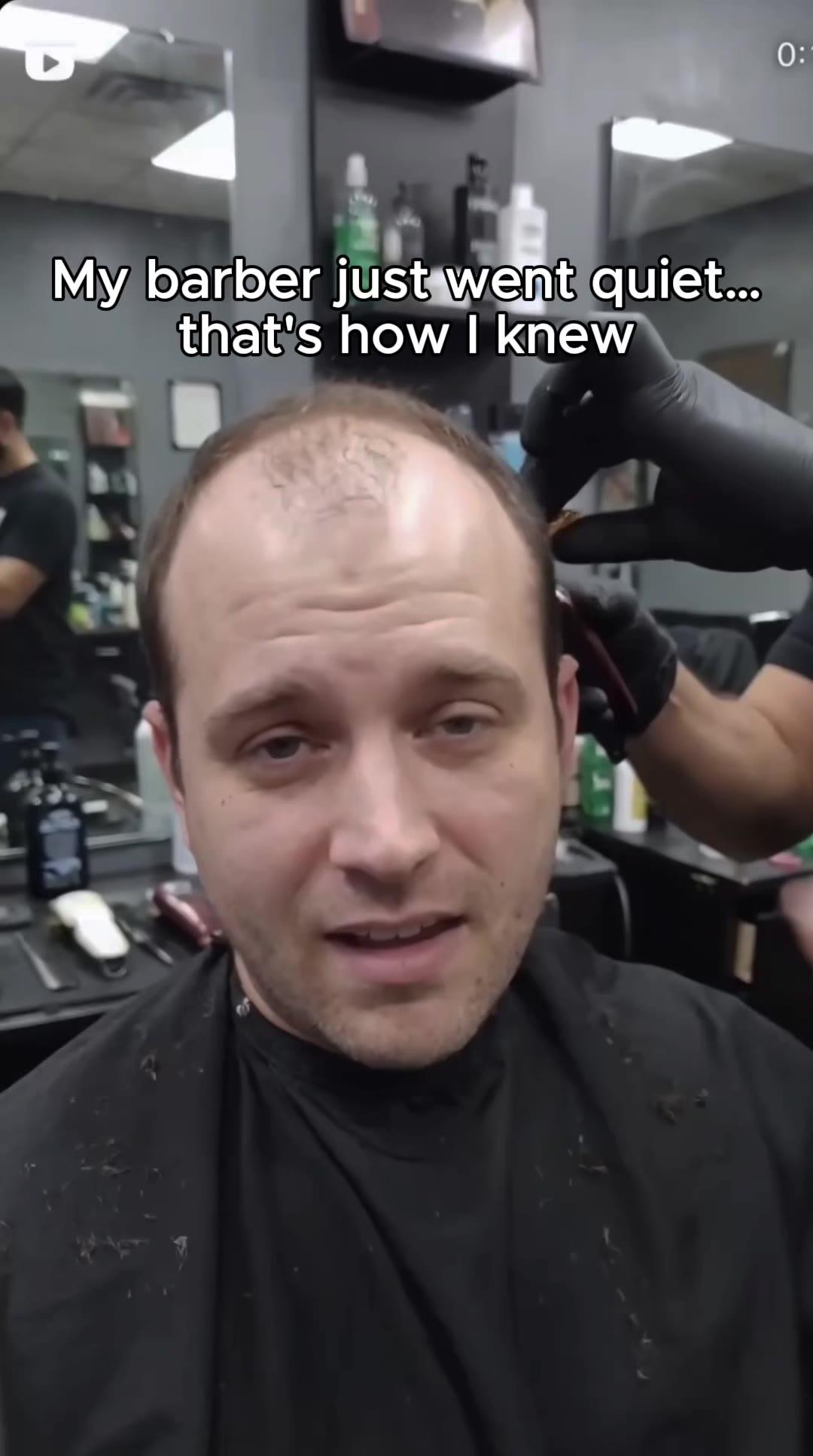
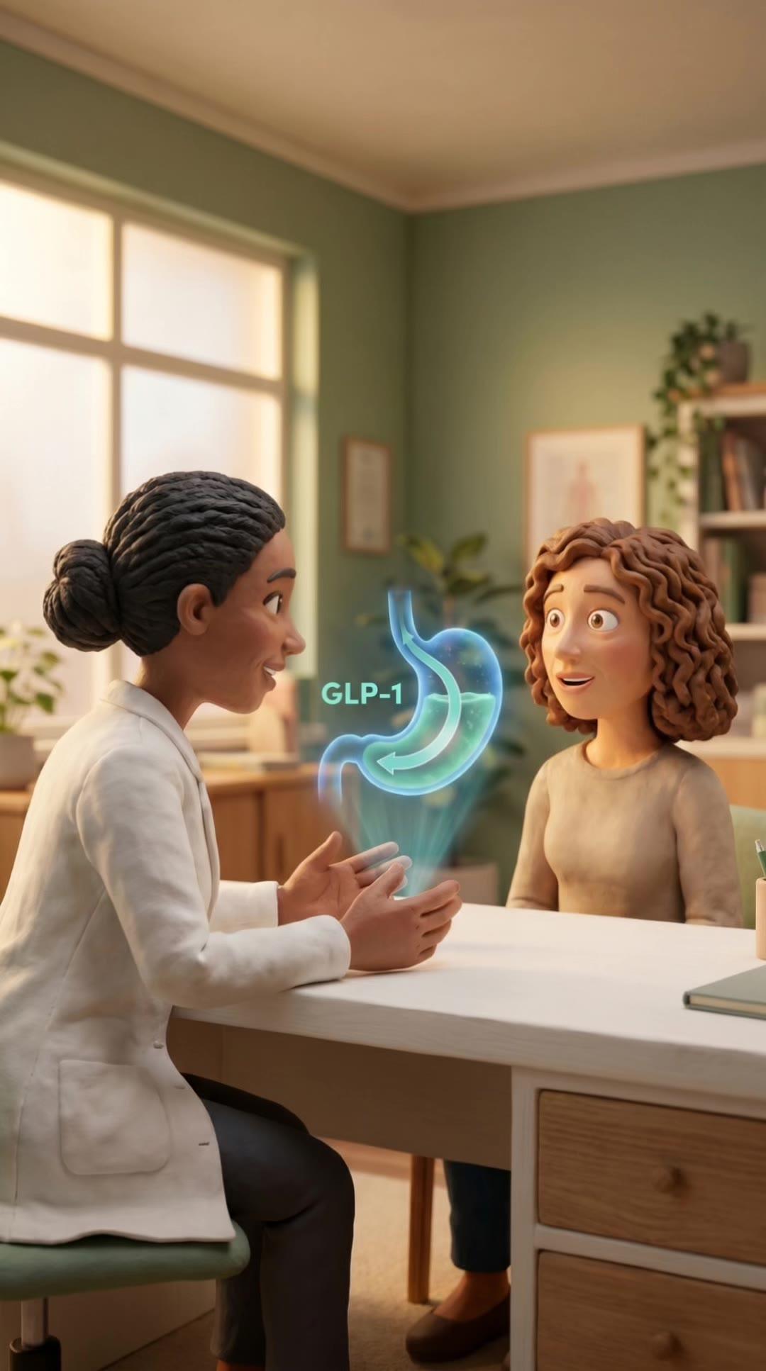
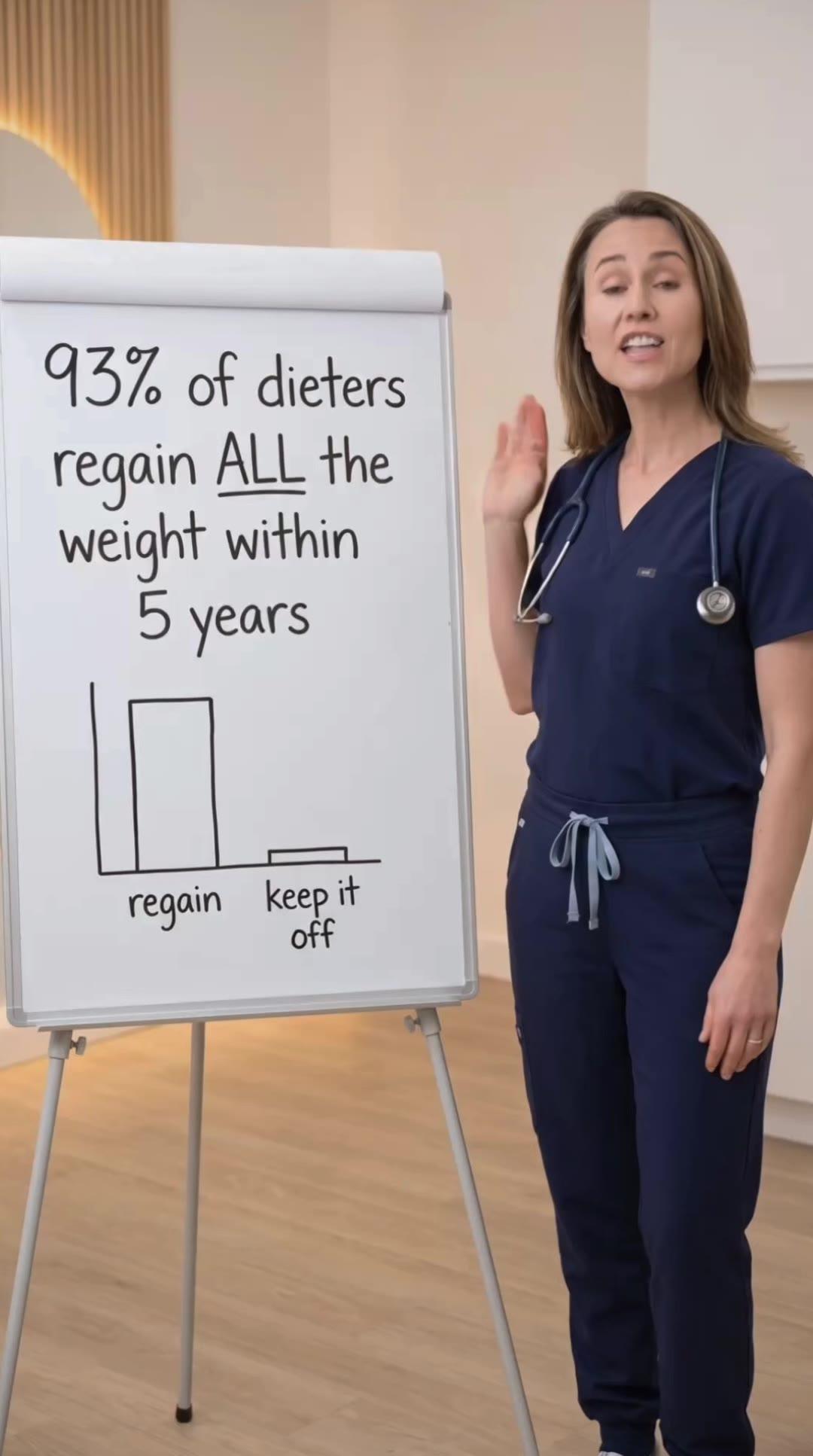
Concepts shown are internal creative studies, not client campaigns.


Publisher pages change telehealth ad creative in ways that many brands do not fully anticipate when they first move spend to whitelisted distribution. The source identity that users see — a health publication rather than a brand or an individual — is not just a cosmetic change. It affects which creative formats work, which hooks land, what compliance framing is most effective, and how users respond to calls to action. For brands building distributed telehealth paid social programs, understanding the creative implications of publisher pages is as important as understanding the distribution mechanics.
The Source Identity Effect on Creative
Every ad carries two signals: the content of the ad and the source of the ad. Users process both, and the source identity shapes how the content is received. An ad from a brand is perceived as advertising. An ad from a persona page is perceived as a personal recommendation. An ad from a publisher page is perceived as media coverage or editorial content — even though it is a paid placement.
This perception difference is not irrational on the user's part. A health publication covering a treatment category carries an implicit editorial standard that a brand promoting its own product does not. When users see a publisher page running an ad about a GLP-1 telehealth service, the framing suggests that a publication found this worthy of coverage — even though the ad is paid. The publisher source identity lends credibility that the brand source identity cannot.
The creative implication is that content from a publisher page should lean into the editorial frame rather than fighting against it. Brand ad creative that runs without modification from a publisher page creates a mismatch — the source says "publication" but the ad says "direct-response advertising." This incongruence is noticed by users and typically hurts performance. The best publisher page creative looks like it belongs on the page that is distributing it.
Hook Formats That Work for Publisher Pages
News and information hooks outperform direct-response hooks on publisher pages. On a brand or persona page, a hook like "I lost 40 pounds with this treatment" or "This is the only thing that worked for my ED" matches the personal endorsement frame. On a publisher page, these hooks create dissonance — publications do not typically lead with personal testimonials.
Publisher page hooks that work better lead with information framing: "What doctors are saying about the new GLP-1 options," "The telehealth approach to testosterone that's gaining traction," "Why more men over 40 are starting this protocol." These hooks signal editorial content — information the publication is reporting — rather than advertising copy. They invite curiosity rather than making a pitch.
Question-format hooks also perform well on publisher pages because they mimic the way publications attract readers. "Is this the GLP-1 approach that actually works long-term?" or "What's really behind the surge in testosterone optimization?" lead with editorial curiosity signals. The question format invites the reader to engage with information rather than respond to an offer, which aligns with how publisher content is typically consumed.
Body Copy Structure for Publisher Ad Creative
Publisher page ad copy performs best when it follows a content-before-conversion structure: inform, establish context, then invite action. Standard DTC copy typically goes offer-first: here is what we have, here are the benefits, here is how to get it. Publisher page copy should invert this: here is the context, here is why this matters, here is how to learn more or get access.
The body copy should establish topic authority before making any commercial claim. Two or three sentences of genuinely informative content about the treatment category, the patient population, or the relevant health issue builds the editorial frame before the product mention arrives. Users who have processed the informational content first are in a different cognitive state than users who encounter a commercial pitch immediately — and they convert at different rates.
Length matters more on publisher pages than on brand or persona pages. Publisher audiences expect more substance from editorial content than they expect from ads. Shorter copy that would work well on a brand account can feel thin and unconvincing when it comes from a publication. Testing longer-form copy on publisher pages — particularly in static image and carousel formats — often reveals that the additional context improves performance in ways that would not apply on other page types.
Concepts we ship across every awareness stage.
See the work →Visual Creative Considerations
Visual creative for publisher pages should match the aesthetic conventions of health media. Clean photography, infographic-style data visualizations, and article-thumbnail-style images outperform high-production-value brand creative when distributed from publisher pages. An ad that looks like it was produced for a magazine works well on a publisher page. An ad that looks like a pharmaceutical commercial does not.
Text overlays on images should reflect editorial styling rather than advertising styling. Editorial text overlays use headline and subheadline structures that read like article titles. Advertising text overlays use benefit callouts, product names, and CTAs. On a publisher page, images with editorial text overlays feel native to the source identity. Images with advertising-style text overlays break the editorial frame.
Video creative for publisher pages performs best in formats that resemble content rather than ads. Short documentary-style clips, expert interview excerpts, and explainer videos that lead with information rather than persuasion match the editorial identity. Direct-response video formats — featuring testimonials with product claims, benefit lists, and "get started" CTAs — are less aligned with the publisher source and tend to perform below their counterparts on persona or brand pages.
Compliance Framing Advantages
Publisher pages offer a structural compliance framing advantage for certain telehealth content. Educational content about a treatment category — informing users about how a medication class works, what conditions it addresses, what the clinical evidence shows — is evaluated differently than direct product advertising. When this educational content appears to come from a health publication, the framing is more consistent with how publications actually cover healthcare topics.
This does not mean publisher pages bypass compliance requirements. Every claim in every ad must comply with FDA, FTC, and Meta policies regardless of the source. But the creative structure that works well on publisher pages — informational lead, context-building body copy, soft call-to-action — tends to naturally produce content that is less likely to make non-compliant direct claims than the persuasion-first structure typical of direct-response brand advertising.
The creative brief for publisher page ads should make this distinction explicit. Inform the team producing this creative that it needs to read like editorial content, not advertising content. Brief them on what a health publication would actually say about this topic versus what an advertiser would say. The more clearly the creative brief articulates the editorial standard, the more likely the output is to be both effective and compliant.
CTA Strategy for Publisher Page Ads
Calls to action from publisher pages should avoid overtly commercial language. "Buy now" and "Get started today" language breaks the editorial frame. CTAs that fit the publisher identity offer access to information: "Learn more," "See if you qualify," "Read the full report," "Find out if this is right for you." These CTAs are still conversion-oriented but maintain the information-first framing that the publisher source identity establishes.
Landing pages linked from publisher page ads should extend the editorial experience rather than abruptly shifting to a brand conversion environment. If the ad reads like editorial coverage, a landing page that immediately launches into product benefits and pricing creates a jarring experience. A landing page that leads with educational content, provides more information about the treatment, and then offers a consultation or intake process creates a more coherent journey from editorial ad to conversion.
Test different CTA framings on publisher pages separately from your brand and persona page testing. The conversion language that works best on a publisher page may be different from what works on other page types. Building this understanding into your creative testing cadence — rather than assuming your best-performing CTAs transfer across all page identities — produces more accurate performance data and better long-term optimization.
Related Articles
Running Telehealth Ads Through Editorial-Style Pages
How editorial-style publisher pages work as ad distribution vehicles and what makes them perform differently than persona pages.
Persona Pages vs Publisher Pages vs Creator Whitelisting
The three main whitelisting vehicles for telehealth paid social — how each works and when to use each.
Editorial Whitelisting for Telehealth Ads
How editorial whitelisting works and why publisher-style pages produce different performance outcomes for certain telehealth verticals.
Whitelisting vs Brand Account — What Performs Better
Head-to-head comparison of whitelisted page advertising vs brand account advertising for telehealth brands.
Ready to build a testing system that scales?
A 30-minute call. We audit your creative approach and show you exactly what a complete angle-format-hook system looks like for your vertical.